Pantone literally means “all colours”. So if you’re eager to access a vast range of colours and shades to determine the perfect colour for your product design, this specialised matching and print system is an absolute must to understand.
What is Pantone?
Pantone is a company that is best known for creating the ‘Pantone Matching System’, which we discuss below.
The company emerged in the 1950s, as a small commercial printing company, originally with the specialty of creating cardboard sheets of colours for makeup companies. In 1956 they hired a chemistry graduate, Lawrence Herbert, to simplify and consolidate their colouring cosmetics system.
By the 1960s, Herbert had established an ink and printing service for the company, subsequently expanding this component. He contacted ink producers and offered to manufacture their inks as a licensed operator, guaranteeing consistent colour results with every print.
One early, high-profile customer was Kodak, who needed assistance to create packaging inks that would not fade or stain.
Today, Pantone is one of the leading producers of print resources and tools, including colours, plastics, paints and industrial designs.
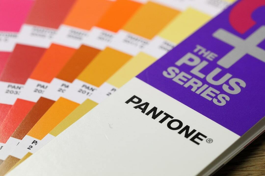
What are Pantone colours?
Pantone colours are a set of shades and hues produced and owned by the company, ‘Pantone’.
Pantone have established themselves as a company that provides bold, consistent and desired colours on every print job.
Using the guaranteed Pantone colours for your design or product will give you a reliable and exact colour result with every print, regardless of the material you are using.
What is the Pantone Matching System?
The Pantone Matching System is a colour matching system created by Pantone allowing designs to, literally, ‘match’ colours during the production process.
Lawrence Herbert developed the Pantone Colour Matching System (PMS) by expanding the colour system used most commonly at that time - the CMYK system.
The Pantone system adds another 15 pigments to the basic CMYK system and enables more accuracy with colour matching and identification. Many printing companies prefer to operate with the PMS system because they can offer greater accuracy to the desired color for their customers. Graphic designers can also work with PMS colours because it enables them to present work that is true to what a printed product or design will look like.
If you are working on the design of a product and want a specific colour to be used, printers can buy or may already have access to the specific PMS colour you select.
How do I find a PMS colour code?
Each PMS colour, or hue, has a unique reference or code. PMS colours are differentiated by unique three- or four-digit identification numbers, followed by the letters U(uncoated), C (coated) or M(matte), respectively
The PMS colour code is the signifier that relates to the exact PMS colour you are after.
Graphic designers can work with PMS colours in Adobe Illustrator, InDesign or Photoshop. Your designer can set their work to display in PMS, and when a PMS colour is selected, you can identify the relevant PMS colour code.
The Pantone colour finder website also allows you to search and match colours.
CMYK vs RGB vs PMS: What’s the difference?
The fundamental difference between CMYK, RGB and PMS is that they are all different colour systems, each with its own features and benefits.
Standard printing occurs as CMYK- cyan, magenta, yellow and black. Millions of colours can be created using combinations of these four inks.
All at-home printers and many commercial printers use this system for their print jobs, with usually satisfactory results. When a job is printed in CMYK, the colour is mixed and created as part of the printing process. For this reason, print jobs done in CMYK may vary a little- the printer calibration results in some inconsistency from the intended colour, or, with some variations across the print job.
RGB colours are created for digital display. Each colour is made up with a combination of red, blue and green. RGB is best used in the digital environment- for your website pages, details and buttons and your images, videos and social posts. RGB colours can’t be printed, because they use light from your monitor or device as a base.
PMS colours, however, are mixed and prepared before the print process begins. This means more consistent and predictable results with a high degree of accuracy for the intended colour. It doesn’t matter what type of collateral you are printing, or the size or scale of your design, you will ensure the same Pantone colour match across all of your products.
How to get unique colours with Pantone
Although some PMS colours can be achieved with CMYK, a majority of the range of 1,867 colours cannot be created with this method.
Most PMS colours are unique colours. They are created with specific premixed inks of each colour, rather than the CMYK inks which use combinations of the four individual ink colours.
Pantone allows for variations such as metallic tones and fluorescence changes. Pantone produce iconic colour sheets that are instantly recognisable, as well as an annual colour of the year.
What Pantone colour tools are there?
Today, more than 10 million designers and producers use Pantone to match and achieve the exact color they want for their creations.
Pantone enables a colour consistency across all materials and finishes, and this accuracy can really help you grow your brand.
Pantone also produce colour charts of the colours they can guarantee to produce. This can help you with colour matching if you have identified a shade or hue from the colour palette that you really want to use.
Conclusion – the importance of using Pantone
Using pantone colours is a fundamental part of your product development. When you’re designing your dream product, you’ll want to have control over every last element - including the colour.
If you don’t use Pantone colours for your product, there is always a risk that the colour you see on-screen during the development phase, is different from the colour that is printed - and which is different again from what was your ideal product was.
Selecting an exact shade for your product is one element that you can ensure consistency in the long-term as you work with a designer who uses Pantone colours.
It doesn’t matter the material or the shape, or if you’re printing on paper, textile or plastics, with Pantone you can get the exact colour combination you desire every single time.
Our expert product development team at The Sourcing Co are experts in the entire Pantone Matching System. We can work the system to find the precise colours you’re looking for to match your branding and create the perfect product for your market.
Get in touch with us today to start discussing your product development.